Broadway Q&A: Here Lies Love set designer David Korins

The first time I interviewed David Korins for Time Out, in 2005, he was a rising Off Broadway talent on the verge of his very first Broadway show. In the years since then, he has emerged as perhaps the preeminent theatrical set designer of his generation: He’s the man behind the scenes of Hamilton, Dear Evan Hansen, Beetlejuice and the current revival of The Who’s Tommy, to name just a few of his two dozen Broadway credits. But none of his past projects have been quite as spectacular as what he created last summer for Here Lies Love, David Byrne and Fatboy Slim’s musical portrait of the morally compromised Filipina First Lady Imelda Marcos. Working with director Alex Timbers, Korins shaped the production in multiple incarnations over the course of more than a decade before arriving at the massive Broadway Theatre, which Here Lies Love transformed completely from a traditional proscenium space into an immersive nightclub experience. This was set design on an unprecedented scale: groundbreaking, radical and thrilling. Korins has somehow never won a Tony Award for his work, but now he has been nominated again. Here Lies Love closed in November, but if Tony voters have any sense, this should be his year.
For all his success, Korins seems to have remained fundamentally the same as he was 20 years ago: candid, articulate, friendly and passionate about his creative endeavors. In this interview at his apartment, we talked about his astounding work on Here Lies Love as well as his career, his design philosophy and his feelings about the Tony race. As a bonus, he took me on a tour through the process behind some of his past projects.

I hate the April crush on Broadway, but I do feel like Here Lies Love would’ve had a better shot of getting Tony nominations, for whatever that’s worth, had it opened later in the year.
Me too. Here Lies Love has sort of dropped out of the consciousness a little, but it is one of the shows—and I’ve worked on a couple, Passing Strange being one of them—where people find me and tell me how important it was for them. People passionately remember all the different iterations, because we worked on this show for over a decade, and we had five pre-Broadway experiences: a workshop at Mass MoCA [the Massachusetts Museum of Contemporary Art], two runs at the Public, a show in London and one in Seattle, each time getting better and better. I actually think that getting four nominations, given that it closed a year ago, is a testament to how deeply it penetrated the community, or the Zeitgeist. It’s an awards-y kind of show, but we opened in the summer. We fought and we jumped up and down about it, and we tried not to have that be the case. But, you know, we also took 12 and a half years to find a theater. We did a site exploration of almost every Broadway theater, and Alex Timbers and I went and pitched theater owners before we found the producers. We were trying to find a home for it. But when we did, we really didn’t have much of a choice about the summer. And it was also, I think, the longest load-in of any show in the history of Broadway. It’s unbelievably ambitious, that design.
The logistics alone must have been very daunting.
The effort of Here Lies Love was so deceptively complicated. Just the engineering of it. When you build a structure that 250 people sit on, and 315 people are inside the structure, and another 500 are behind the structure, and another 38 are underneath it—every single floor plan that we made had to be individually permitted with the city of New York, because every time it moved, the fire egress moved. How people could get in and out, life safety, ADA regulations, all those things—just the conversations with the architects alone was years before we even talked about design, materials, lighting, any of that stuff. Even just the removal of the front-of-house balcony rail, which we made into a catwalk; we had to make that be a weight-bearing catwalk for actors to be in and amongst the audience. I remember Alex and I were standing there looking down thinking, “I can’t believe the Shuberts gave us the keys to do this.” Like, we used to do this stuff downtown—figuring out these macro moves—but I couldn’t believe we were doing this in a Broadway theater. It was just insane.
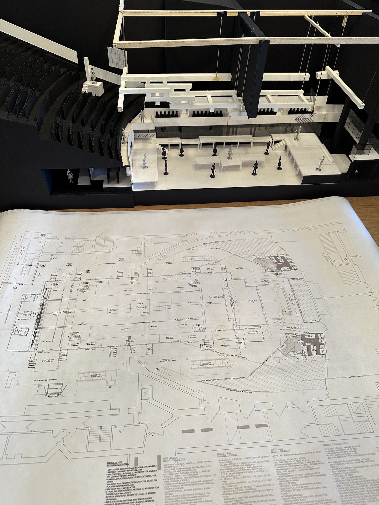
There are other shows with immersive elements on Broadway, but this was on a totally different level.
I think those are environmental, and ours was immersive. There’s a big difference between what happened at Here Lies Love and some other things that present as environmental. This was written into the DNA of the show. David Byrne saw Grace Jones pop up at Studio 54 on a platform amidst a crowd, and was like, “Huh! What a dynamic, interesting way to stage a performance,” and filed that away in his mental Rolodex. Then he saw a photo of Imelda and an arms dealer under a disco ball, and thought, “Oh my God, this is amazing.” And he went and did the research and wrote the show. So when the Public and Alex were gonna do the show, it was like: How can we literally cast the audience as a group at a wedding, at a funeral, at a protest, a riot, an election, whatever it was—and at a nightclub? How can we move seamlessly in and out of that? Will that even work? And for that not to be about a room that’s branded as a different experience or something, but to really be what the show is. The superstructure of the show was built around how we could make the people the pivot. I don’t think there’s ever been a show where people actually moved around like that on Broadway.
It’s hard to even imagine the show in a traditional proscenium staging, without that immersive element.
And that’s the challenge. It’d be interesting to see what happens if David ever tried to produce the show again—if he would lose that. But when the producers signed on, they were audacious enough to honor the original idea of this thing, and not to try to make it more feasible for Broadway.

Incorporating the audience is so central to the way the show works and what it is saying.
It’s a really important show, I think, because it’s about the fragility of democracy and how close we come. What is brilliant about the writing is that it’s a complicated thing: You fall in love with the rags-to-riches story of this poor person who rises to extraordinary prominence and power but who then goes from being the protagonist to being the antagonist and ultimately the villain. It dupes the audience in an interesting way.
Here Lies Love is very Evita-ish, obviously, but in that way it reminded me a lot of what Alex did in Bloody Bloody Andrew Jackson—the way it builds the central character up in a fun way, and then takes a hard turn.
And it also hits differently to root for a dictator in 2024. We worked really hard to calibrate that. People were into it and having a really good time and then realized, “Wait a minute, I’m supposed to be against this person. I’m kind of complicit in this.”
Which is a complicated reaction. And that poses a bit of a marketing problem, I imagine. Natasha, Pierre & the Great Comet of 1812 ran into this trouble, too, because it was sold as a big party when it was mainly an ambitious adaptation of War and Peace. People got confused. And with Here Lies Love, a lot of the sales pitch was understandably like, “Come have a wild time in a big disco”—which is part of the show, but then it gets serious and people go, “Wait, what is this?”
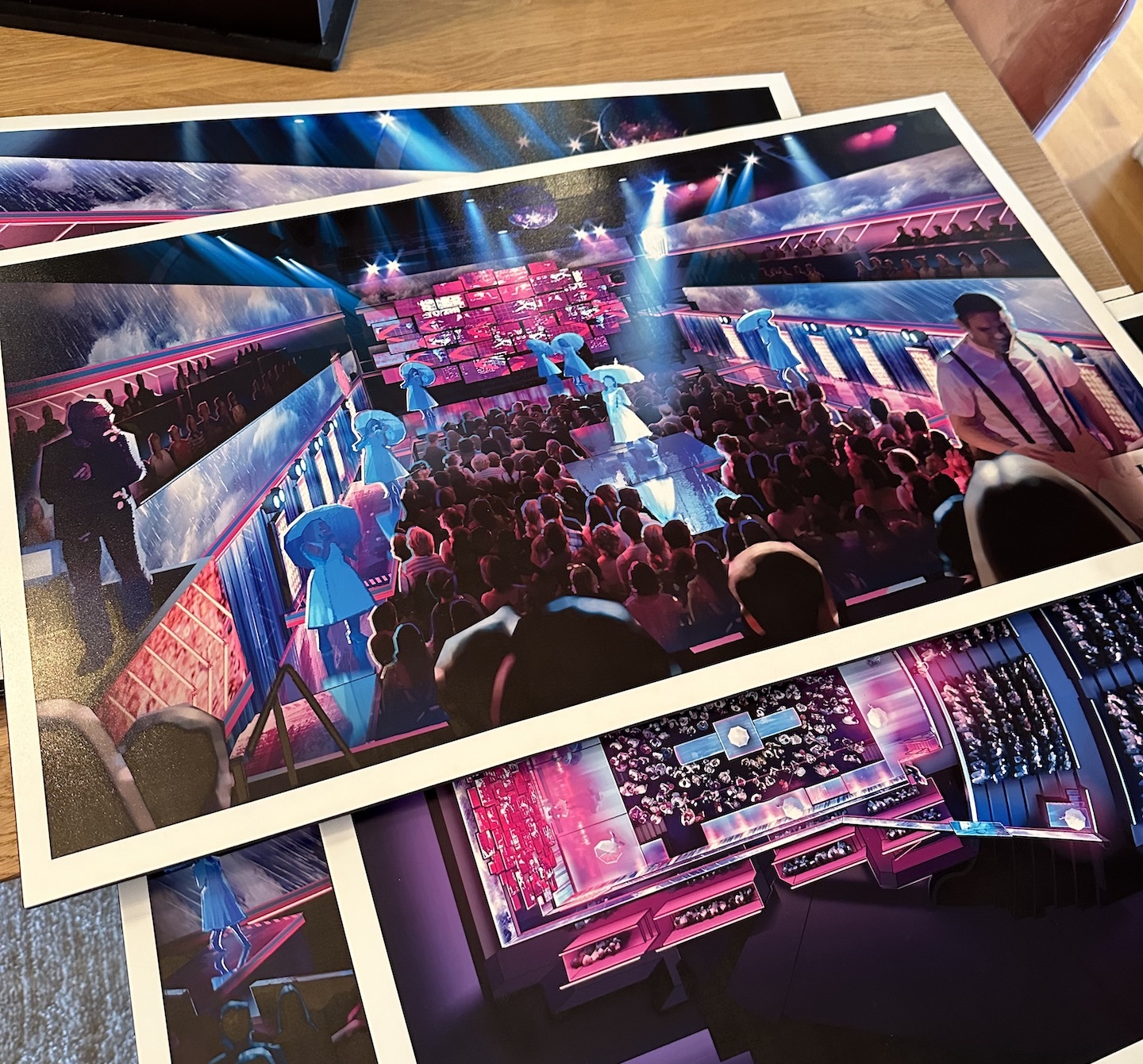
A hundred percent. You nailed it. It was hard even explaining to people the different ways in which they could possibly buy a ticket. I made all these renderings to kind of explain what a view might look like from the front mezzanine looking down into the box, or from a side looking down, or from the ground looking up.
It didn’t run long, but I think of Here Lies Love as a great artistic success.
Me, too. And, you know, what makes a show successful? With Here Lies Love, I would imagine they lost all their money, but artistically it was such a huge success, on every level. It redefined so many different things. It was so extraordinary to actualize the show at that level, especially since we started at Mass MoCA, pushing platforms around. So in that way it was such a beautiful experience. We maintained everyone, like the whole creative team plus all of our associates. It took so long. We all got so old! But everyone stayed. And everyone’s institutional knowledge was the only thing that allowed us to move to the next step. If we had to start over with any single discipline—like even where the quick-change booths are, or how the performers got in and around the space—we would’ve been in trouble. So we got really lucky in that way. And it was a home-run, extraordinary artistic success. But so much of Broadway is about commercial success and so much of what people think is successful is because of box-office numbers.
One of the show’s four Tony nominations was for your design, which must feel good.
Honestly, my relationship to Tony nominations is very complicated. I’m just gonna say: I have been down this road before in such varied offerings, and I never really understand how you can quantify and assess one person’s contribution to a project. It’s the icky part of the business, because on the one hand it’s a beautiful, incredible honoring of an effort of work, but also you’re subjectively comparing artistic offerings.
And because of the nature of the beast, great work in shows that have closed or that were not otherwise well-received often end up being overlooked.
Yeah. I remember I was sitting there at the Tonys one year, and they called a name, and [another nominee] leaned in behind me and said, “They vote for most set design, not best set design.” But then again, I’ve also been there with the most set design! [Laughs.] So maybe it’s something else. I don’t know how it goes down, but it really does make me uncomfortable thinking about it.
When you got nominated for the first time, for Hamilton, you’d already designed many shows on Broadway—but smaller shows, which are not what tend to get nominations.
Except for Chinglish. Actually, Chinglish is a really good example—Chinglish should have been nominated, you know? People said to me, “Oh my God, you’re gonna get nominated. You’re gonna win.” But at that moment in my life, I was blissfully ignorant of what all that was. I wish I could remain that way, to be honest. Now, I wake up and I watch the nominations because, you know, whether Tommy got a Best Musical Revival nomination or not was a really important thing for the business of the show. As an artist, I kind of hate that it’s important—but it is.
I was just looking back at the first interview we did together back in 2005. We were talking about the seemingly simple swaths of black fabric that formed the background design for Thom Pain (based on nothing). You said: “Every single fold and dip in those panels was designed and sewn in. We hung up the fabric, we made it crooked—we made it look like it was sort of thrown together by the house staff very quickly. People walked in and said, ‘Oh my God, there are no production values.’ But that’s design! Nothing in this world is undesigned.”
That is the challenge of what we do. There are no economies of scale. I mean, okay, in this instance here, Here Lies Love actually was a harder design than Thom Pain. [Laughs.] But I do think that our job continues until the last second. There’s wet paint on every single first preview. Set designers at their best are co-conceivers of a space of how you’re gonna tell the story: interior designers, engineers, architects. There’s never a shortage in the level of detail. Whether it’s realistic or abstract, the way in which they get rendered on stage is unbelievably specific and detailed. I was doing a talk with a group just the other day, and of course they were talking about Beetlejuice and Hamilton. But I was saying that the greatest compliment I’ve ever received is from an actor saying, “When I step on stage and I look at this desk or I look at my prop, I know exactly who I am.” Because those are things that the audience never sees. They inform the performances and, through that, the way in which we attach to the show.
Even in the case of those two shows, though, the design in Beetlejuice is a lot showier than it is in Hamilton.
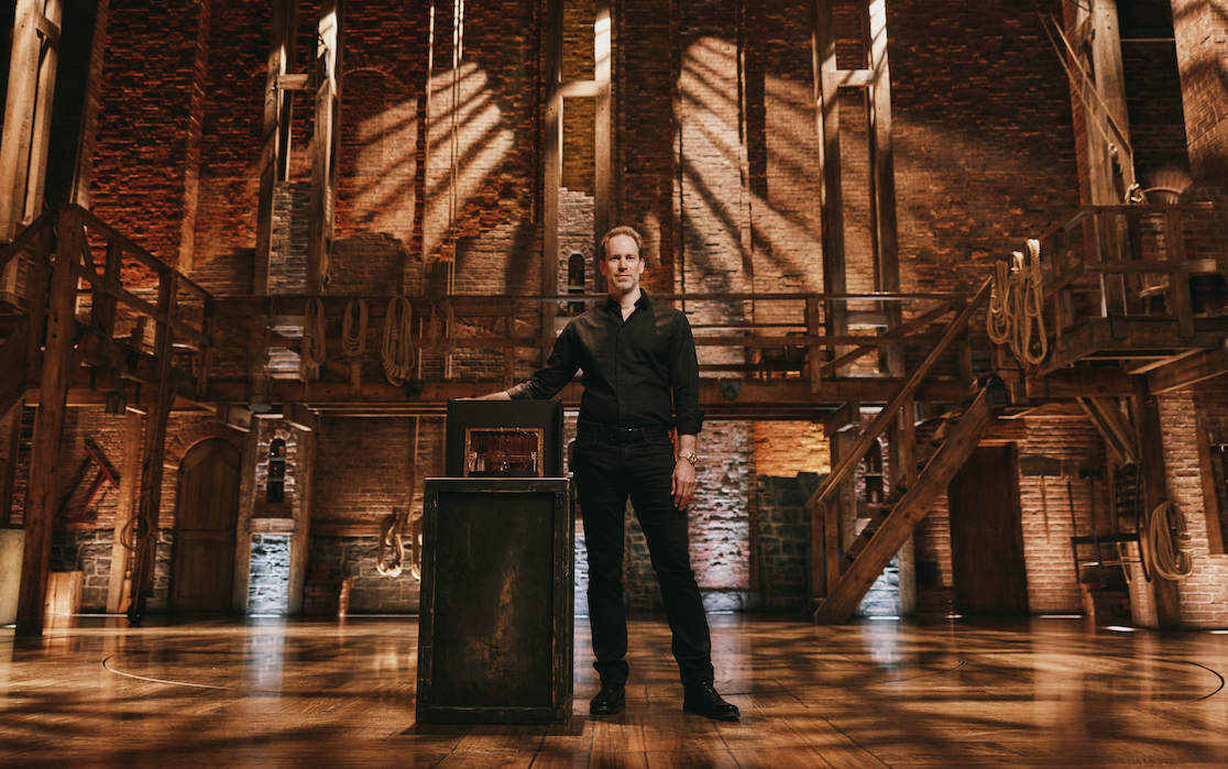
But Hamilton was no different. The thing that we didn’t know about Hamilton was whether people would be able to follow it at the tempo that Lin wrote. We had to find a way to focus their eyes—so you know who’s talking, so you can understand it. Even the shade of the bricks we used was important. The conversation with [costume designer] Paul Tazewell and [lighting designer] Howell Binkley about that specifically—the color tone of that. We were thinking about skin tone and lighting and costuming, and calibrating all of it. That wasn’t one hour-long meeting; that was weeks and weeks and weeks of conversation. We went through over 30 variations of the color of brick. And then it all kind of gets dismissed as, like, “Oh, yeah, cool bricks!” [Laughs.]
As though it were in a bare theater! Right. The shows on your Broadway résumé range from some of the most spectacular designs of the 21st century—like Here Lies Love and Pee-wee and Misery—to some, like Just for Us, that are about as minimal as can be imagined. So your approach does seem very show-specific.
You know, a long time ago—and maybe this is because I used to produce shows—I made a decision not to impose my design opinion upon what the show should be. I spent a lot of time producing shows with living playwrights. And I always felt the responsibility of sitting down with a playwright and saying, like, “Tell me about this stage direction. What is specifically going on in the room?” I remember David Henry Hwang said to me, “I have to be honest, I feel a little uncomfortable. No designer has ever asked me these questions. They just sort of…design.” But it’s all a collaboration: You’re building these worlds, you’re midwifing these things into existence. My goal was to not have someone walk in and say, “Oh, it’s a David Korins set.” Hamilton should look very different from Here Lies Love and Beetlejuice and Dear Evan Hansen and Pee-wee Herman, or it’s a problem.
When you mention working with living playwrights, it strikes me that nearly all of your Broadway shows have been new works. Annie and Godspell and Tommy were revivals but even there, most of the authors were alive at the time.
I don’t know any other way but to ask the playwrights. Because I’ve discovered that they might be writing about a parlor, but what they’re actually talking about is their specific childhood home. Or it’s set inside such-and-such a school, but actually it’s their own high school. So the best parts of mining the territory come through conversation and collaboration. I know that sounds kind of corny, but once you get people opening up to that experience, they realize, “Oh, I didn’t know it, but I was writing about my grandmother’s house.” I’ve experienced that often in the last 25 years. Go to the source.
I want to talk a little bit about your work this year on Tommy, too, because I think that production was underrepresented in the nominations. That’s partly because of overcrowding, but I also suspect that the fact that it was directed by Des McAnuff, who also directed it 30 years ago, gave people the incorrect impression that it was a retread of the original production.
Getting the phone call to work on Tommy was a bit of an out-of-body experience. I didn’t see the original, but you can’t work in technical theater without knowing that it looms extraordinarily high in the pantheon of great, needle-moving shows. So when Des called me, I felt like I had an insider secret: Oh my God, you’re doing a revival of Tommy? This is so exciting! That was about five and a half years ago. And Des said, “I know what works in the show, and I know what doesn’t work. But I’m also completely open to wiping the slate clean.” That’s a pretty big deal. Can you imagine Tommy Kail reconceiving Hamilton or Alex Timbers reconceiving Moulin Rouge? I was like, Really? You want to just start over? And he did! And I felt honored that he would ask me, because it’s such a seminal show. We immediately talked about [projections designer] Peter Nigrini, and we immediately talked about Howell [Binkley] lighting it—at the time Howell was alive, but it became clear that he wasn’t gonna be healthy enough to do the show, but Amanda [Zieve] was his acolyte. In a way it was a blessing that the pandemic happened because we got to sit at that dining room table and storyboard the show piece by bloody piece. Des had the rigor to show up at every meeting and throw out what he did originally. That show has a lot of visual firepower—and, I’m told, very differently than the original.

The tech of it alone seems incredibly complex.
It’s interesting, because Tommy sort of takes place in the future at times, and this design was not possible even six months ago. Those light bars are things that I’ve dreamt up and contemplated for years—and now, due to technical advancements, we can actually put them into the show. And it’s the same thing with those flying panels, those Muxwave panel—it’s basically a piece of glass with LED nodes inside of it, so it’s completely see-through, or it can have content all over it. It’s kind of like the world’s most advanced version of a scrim, where you could front-project it and have an image or then it could be see-through. I think it’s how advertisements will happen in the future. There’ll be windows, and then on the windows you’ll see video content. It’s the first time it’s ever been used on Broadway. It wasn’t even available when we were doing the show at the Goodman. That’s how new it is. It’s never happened before. So it’s kind of like the design is living in the future. And nothing moves faster than light and video, right? The whole thing is kind of a magical, three-dimensional, dynamic, glowing Mondrian thing. And I actually think the show is more powerful now than probably it was in 1993, because we’ve all just suffered and still suffer from this incredible trauma—this trauma about isolation. And so the most powerful moment in the show I think is the one where there’s no scenery: when the actors break the fourth wall and just stand there and sing “Listening to You.” It’s this human-connection moment. The hairs on my arms are standing up just as I tell you about it! The humanity of that wall of people and that sound smash through the isolation. And in the audience, people stand up and they stay up for the rest of the show. Consistently. And I feel like it’s a really good example of a completely cohesive collaboration. Direction, choreography, lighting, video, sound and scenery: You don’t know where one of them starts or leaves off for most of the show.
I found it disappointing that Lorin Latarro wasn’t nominated for her choreography in this show.
I think it’s her best work! But who knows. As I said to Lorin and other people on the day of the nominations: We have no idea. It could have been that Tommy was one vote away from having 13 nominations. We really have no idea really how that goes. And frankly, I think if you get caught up in that—having been a person who’s been caught up in that…you just can’t.
I feel like there’s sometimes a weird dynamic where the most obvious candidate doesn’t get nominated because everyone on the committee thinks they’re gonna be nominated by someone else. It’s a complicated thing.
And I think people think I have 10 Tony Awards! [Laughs.] Every single person that congratulated me—almost to a person—was like, “Congratulations, but you already have so many, right?” And then you have this sad moment where you have to tell them—where you have to spend the next six weeks telling people how you actually don’t have Tony Awards.
The Who’s Tommy is playing at the Nederlander Theatre. You can buy tickets here. This interview has been edited for clarity and length.
BONUS: A PEEK AT DAVID KORINS’S PROCESS
Hamilton:
“This is kind of a microcosm of how a show is put together. This is the original script when it was called Hamilton Mixtape. And these were things that I wrote down in my interview with Tommy Kail. Bad idea, bad idea—but there’s the Winter’s Ball, and there’s the double turntable.”
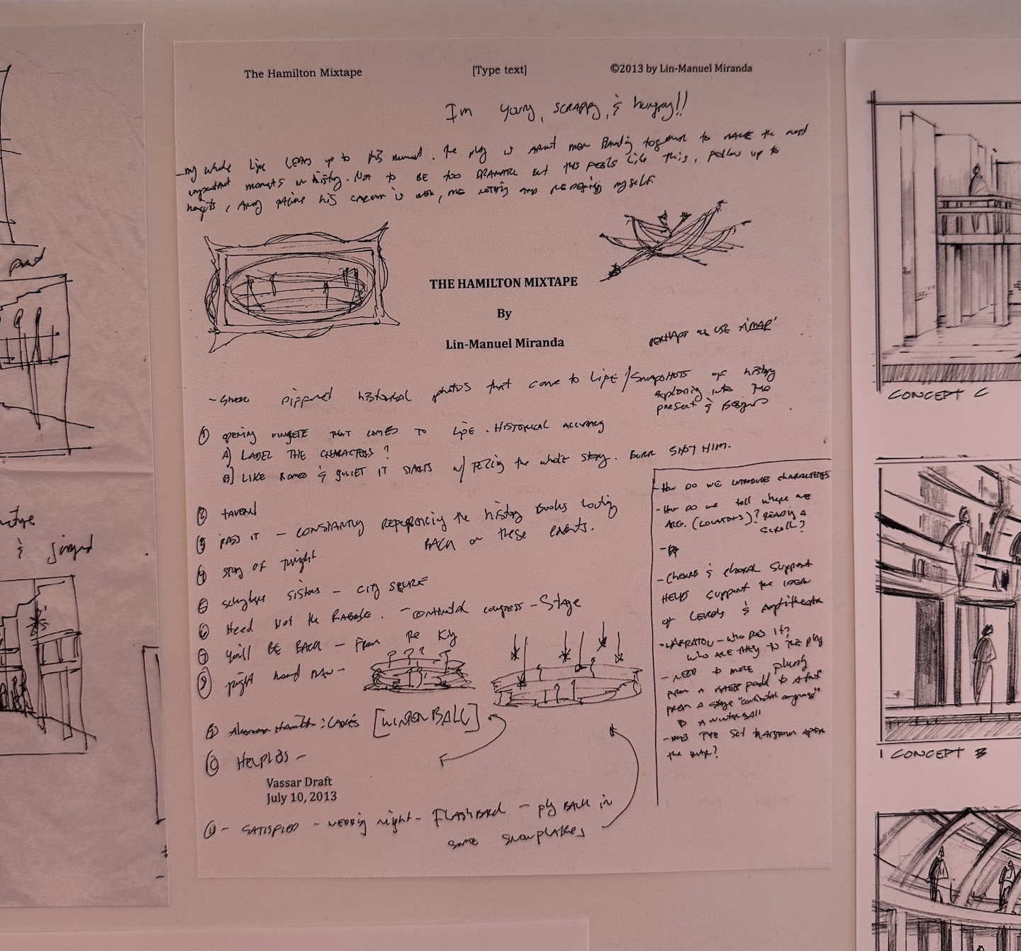
“Another bunch of bad ideas: a dirt floor, a big piece of parchment with a crow’s nest, a huge column monument that was going to be part of an ending to the show that we didn’t go with. But there’s “Helpless”/”Satisfied,” there are the candle wagons—that’s kind of ultimately what it becomes.”
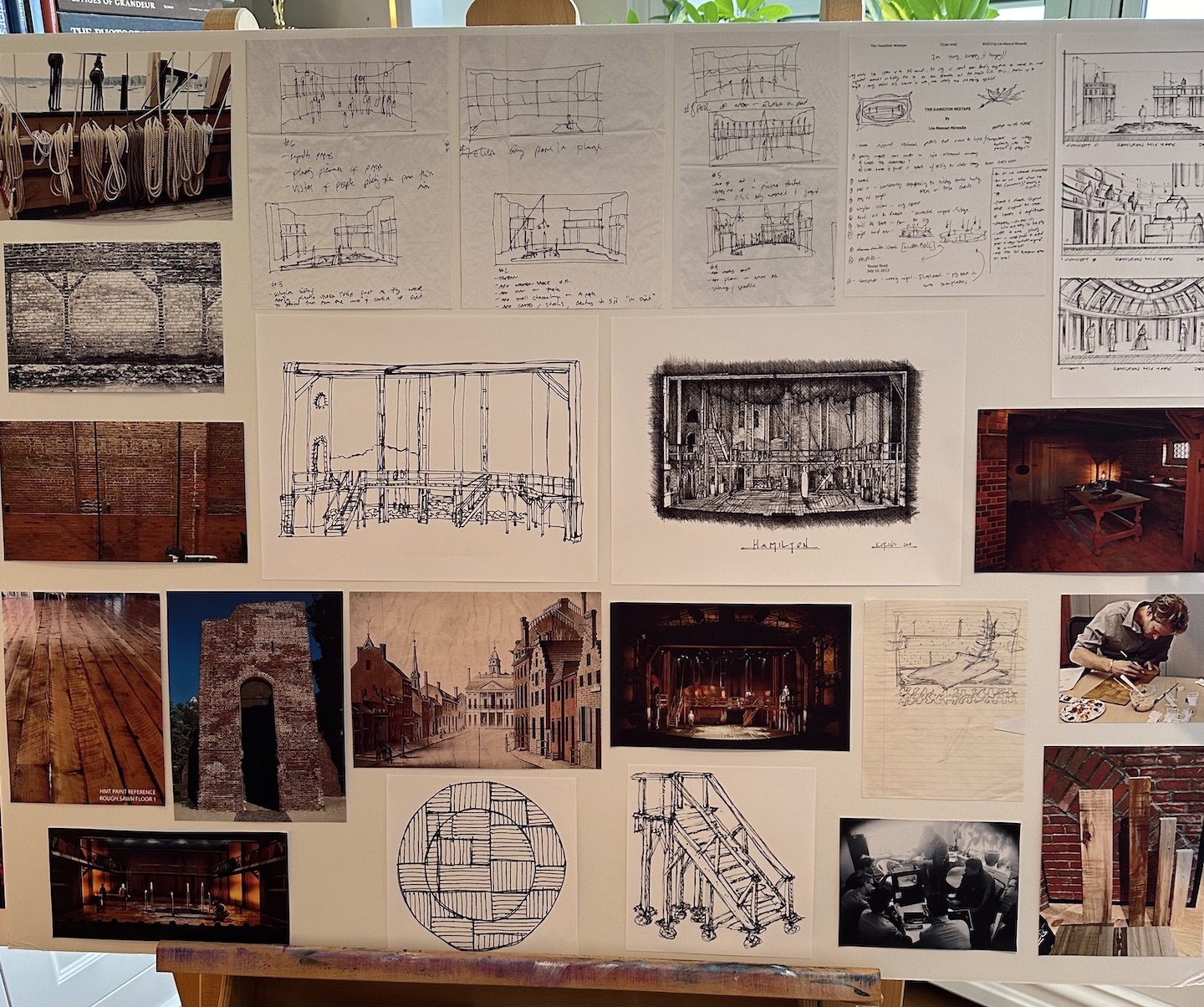
“We actually built a six-foot-diameter reflecting pool, but only 600 people in the world ever saw it. Eliza crossed a bridge over the water to be rejoined with Alexander and they stood there in this beautiful glowing light. We had it in three previews and then Tommy cut it, because the question people were asking at the end of the show was not ‘Who lives? Who dies? Who tells your story’—it was, ‘Is that real water? Was that there the whole time? Like in the turntable?’ So we drained it and we let it sit there for the rest of the Public run. [Otherwise] it’s the same set [as Broadway]. It’s a little taller and wider, but the scaffolding at the bottom is literally from the Public. I etched my daughter’s initials into the set, and they’re still there!”

Dear Evan Hansen:
“On Dear Evan Hansen, I took a piece of paper and I folded it up into sixteenths. While I saw Ben [Platt] do the original reading of the show, I did 16 little tiny sketches—all of these. And then in my first meeting with Michael Greif, I opened it up and said, ‘Here are 16 things I drew.’ And he went, ‘Hmm, what’s that one?’ I mean, look at that: a little disc with a little windchime of stuff. And that’s what became the set.”
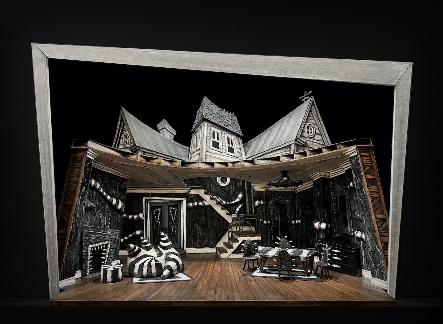
Beetlejuice:
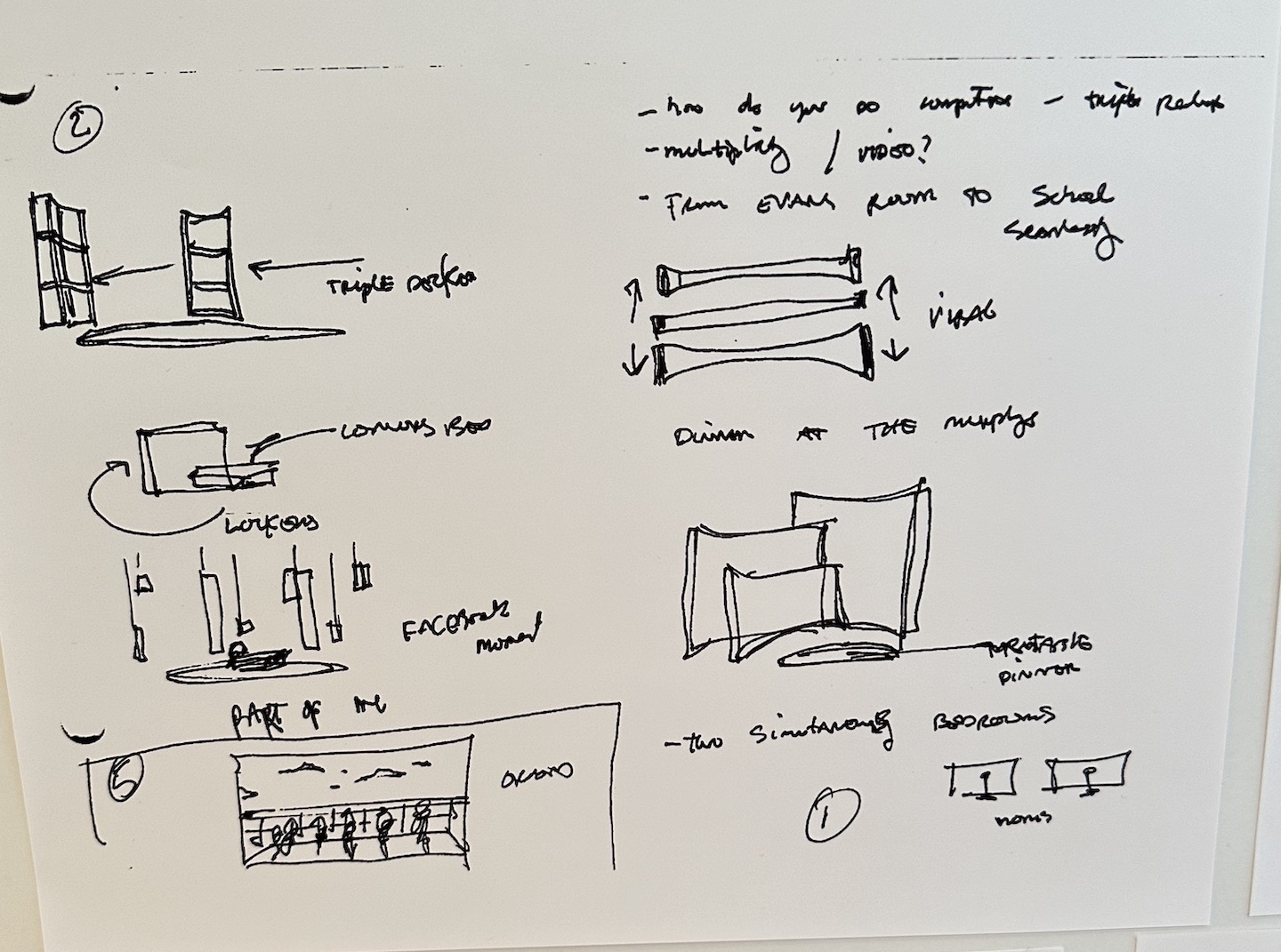
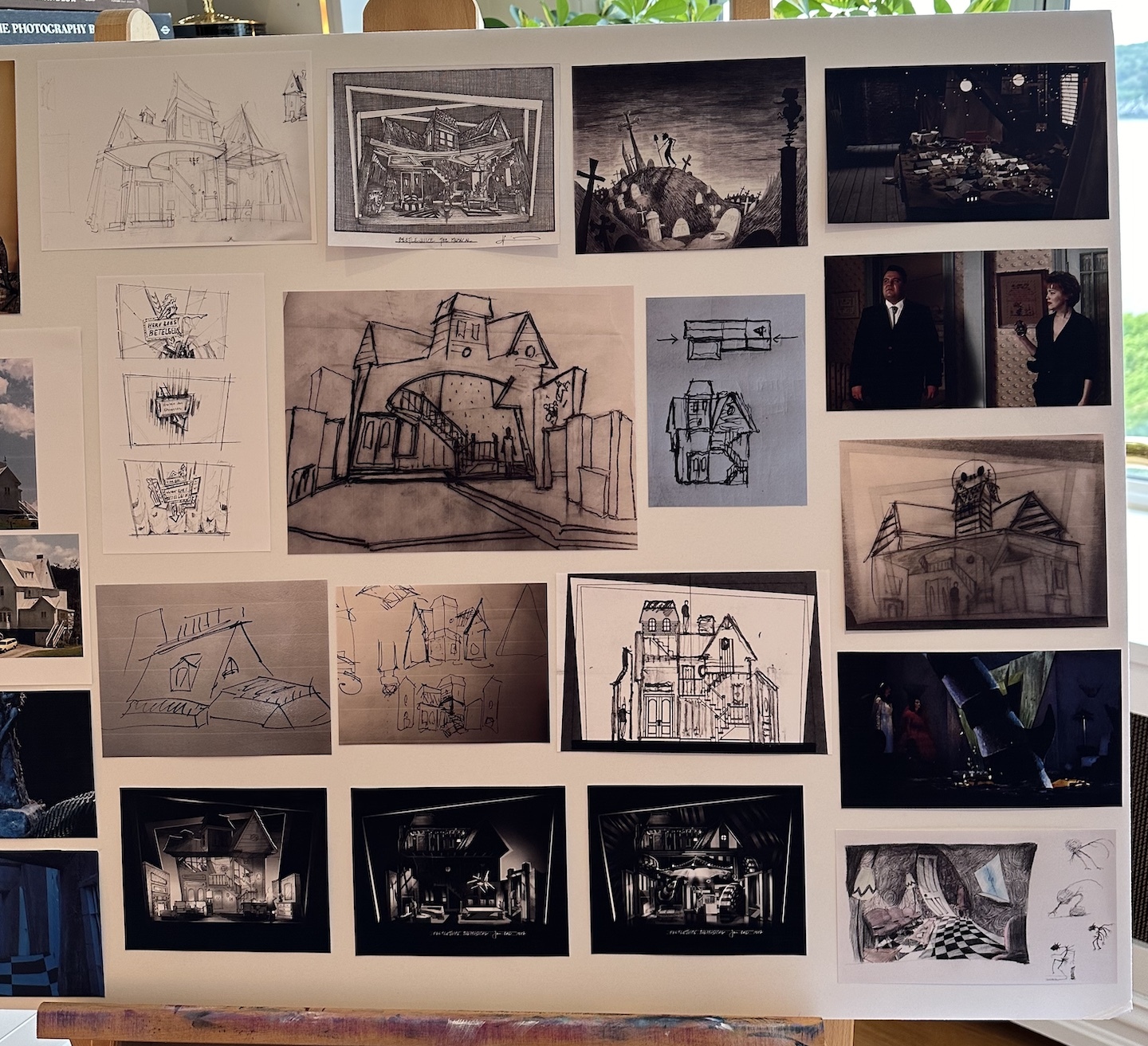
“Here’s the Beetlejuice process. It’s the same thing: It starts with the research, then a really bad first version, then the sketches get refined.”
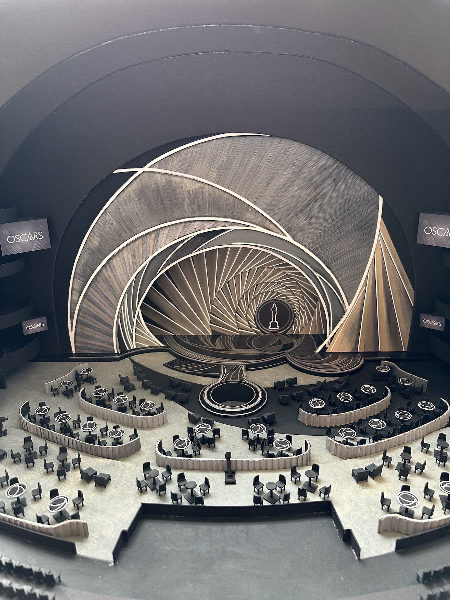
The 94th Academy Awards:
“The slap happened and I get a phone call the next morning, not from one person but from 38 journalists saying, ‘Do you think that your immersive design…’—because we took out all the seats—’Do you think that your design contributed to the ease with which Will Smith was able to get to the stage and hit Chris Rock?’ And I was like, This is…a no comment moment. Can you imagine? I was like, Am I going to be pinned for this? I’m sure Will Smith would’ve been on an aisle anyway.” [He laughs.]
